
There is a moment in most beauty shoots when the conversation stops being about logistics. The product is on set, the lighting is dialled in across a dozen test frames, the camera is locked. Then someone – usually the brand’s person, usually quietly – asks the question that decides whether the next eight hours are worth anything: does this look like what it actually is?
It sounds simple. It isn’t. Whether an image tells the truth about the object in front of the lens, or flatters it, or tips into the uncomfortable territory of misleading, is the tension a commercial photographer negotiates every time the shutter fires. After years producing beauty and product photography in Singapore for global brands, we have come to think of it as one of the more interesting design problems in the city’s visual culture – not because the question is new, but because the cost of getting it wrong is now measurable in a way it never used to be.
The Problem With Making Things Look Good
Beauty photography carries a constraint most visual work doesn’t: the image has a job. It has to make a buyer trust a product they can’t touch – the weight of a cream they haven’t felt, the colour of a lipstick they haven’t swatched, the finish of a foundation they haven’t worn. The photograph is standing in for a sensory experience it can’t reproduce.
For most of advertising’s history, that gap could be papered over with aspiration. Images were lit, styled and retouched until the product on the page barely resembled the one in the buyer’s hand, and there was little the disappointed buyer could do about it. A woman who bought a lipstick from a magazine and found the colour wrong had no real recourse and no audience for the complaint.
The ecommerce era removed that cover. When a buyer discovers that the foundation they ordered photographs lighter than the one that arrived, they don’t stew quietly – they leave a review, and that review travels. The commercial tail of a single inaccurate colour can run for months. We didn’t learn this from analytics; we learned it from the briefing conversations that happen before the shoot. When a global brand gets specific about colour accuracy, it isn’t being fussy about aesthetics. It is managing a revenue risk. That shift – from making a product look good to making it look accurate – changed how we approach a set.
What Colour Accuracy Actually Means
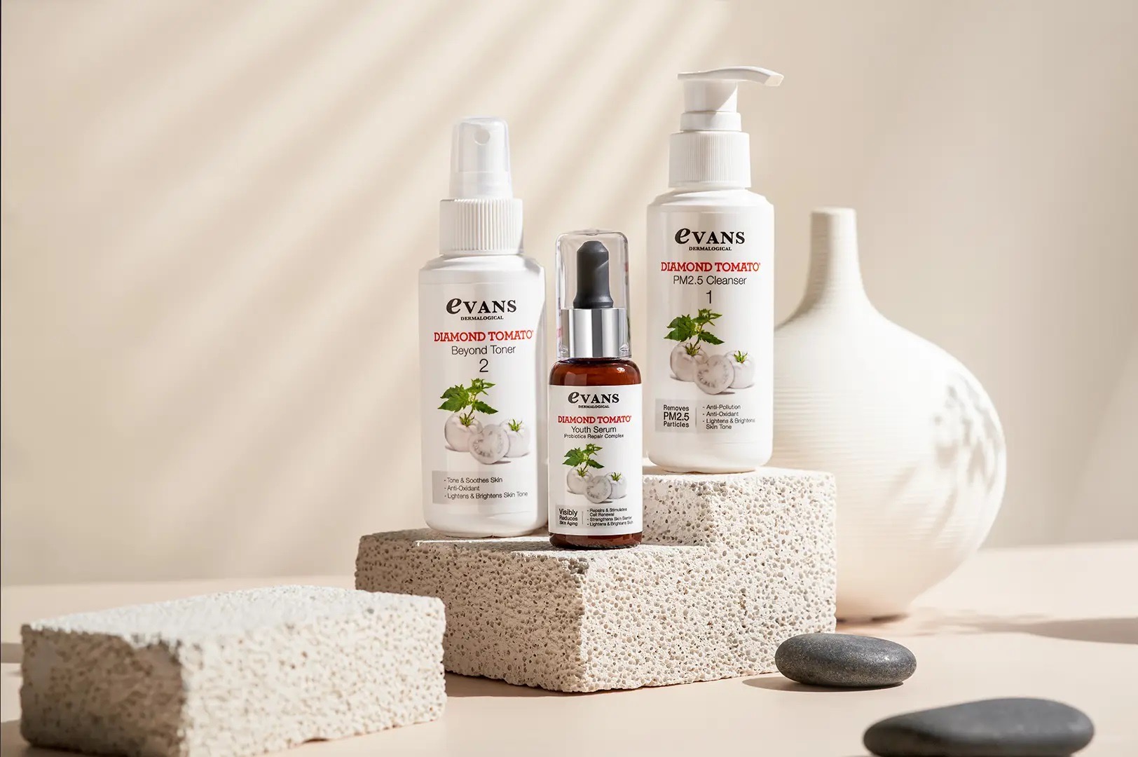
“Colour accuracy” sounds technical enough to ignore. In practice it describes something anyone can see instantly: whether the red of the lipstick in the photo is the red of the lipstick in the tube. Whether the foundation’s undertone reads warm or cool in the image the way it does in the bottle.
Getting there is harder than pointing a camera and pressing a button, because light has colour. Daylight leans blue, tungsten leans warm, older fluorescents drift green, and each of those shifts how a surface renders. A product lit slightly warm photographs with a warmer undertone than it has. Across a beauty range where the whole difference between two SKUs is a subtle shift in shade, those small errors become commercially real.
Managing it takes calibrated lighting held at a consistent colour temperature, a colour reference target shot into the session, colour-managed monitors for review on set, and files delivered in the right colour profile for where they’ll be seen. Buyers never notice the workflow when it works. They only notice when it fails, and by then it shows up as a return.
The interesting part is that this technical discipline is, underneath, a commitment to a kind of honesty. We aren’t trying to make the product look better than it is. We are spending real effort to make it look exactly as it is. In a visual culture drowning in images built to persuade rather than to inform, that turns out to be a more absorbing problem than it sounds.
The Materials That Fight The Camera
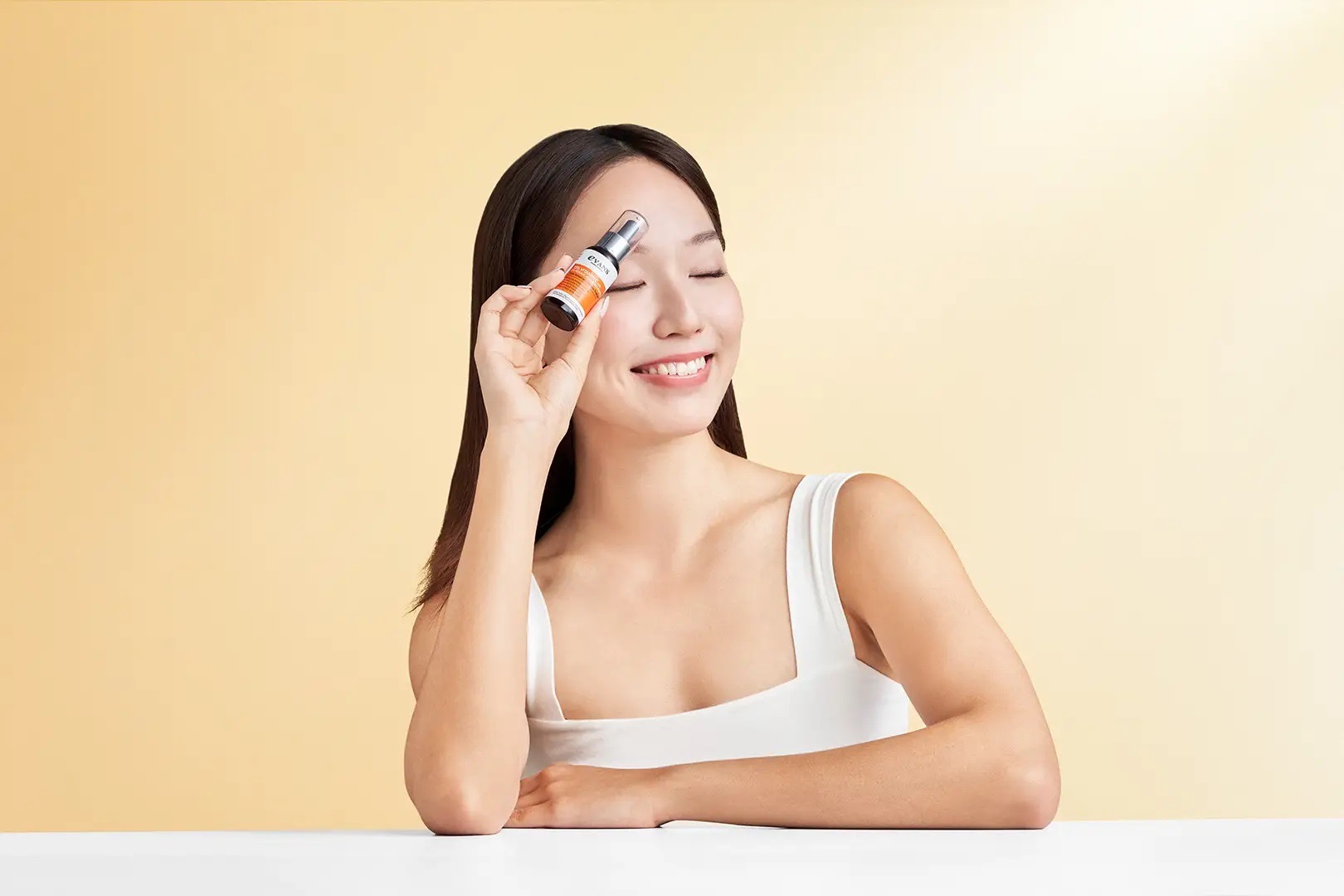
Beauty products are among the most demanding subjects in commercial photography, and not because they’re small – macro work is well understood. It’s the range of surfaces that turn up in a single range, each answering to light differently.
Glossy packaging, the default for premium brands, reflects everything: the camera, the lights, the ceiling, the photographer. Taming it takes large, diffuse sources that soften any single reflection, black flags to keep the camera out of the surface, and careful angles between lens and product. Done well, the packaging glows with an even sheen. Done badly, it becomes a mirror of the studio.
Transparent and semi-transparent packaging asks the opposite. A glass serum bottle has to show the liquid inside – its colour, clarity, texture – while the reflections on the glass stay under control. That balance comes from backlighting the bottle so light passes through to reveal the contents, held just short of blowing out the glass itself.
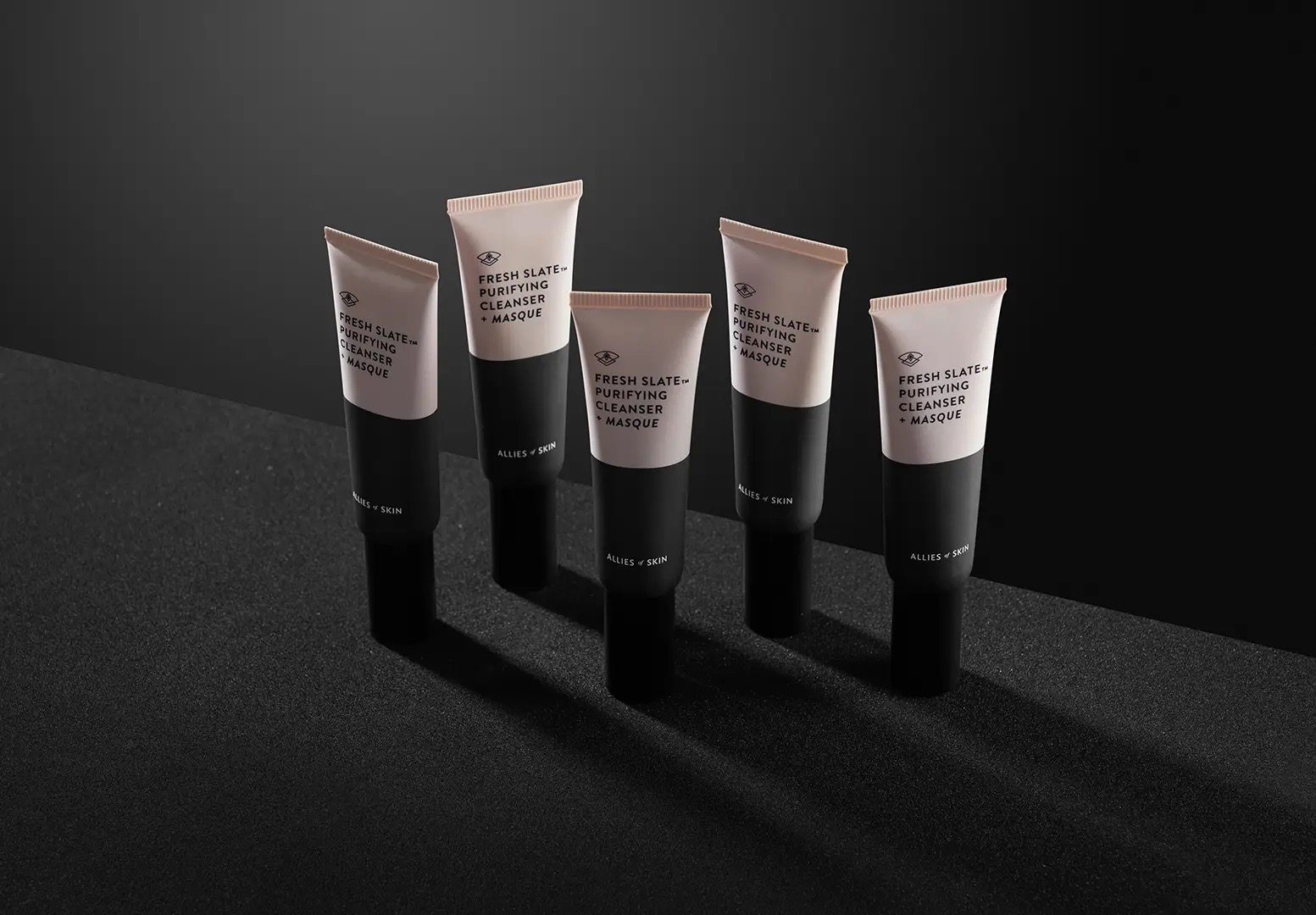
Metallic and foil packaging is the hardest of all. A curved metallic surface reflects the entire room in one continuous band, so every light, wall and stand ends up somewhere in the product. The fix – a large panel of diffusion that lays a smooth gradient across the metal instead of a hard point of light – is the same physics used to photograph car bodywork. Different scale, identical problem.
Each surface forces a decision, usually a compromise: show the colour perfectly and accept a faint reflection, or kill every reflection and lose some of the surface’s dimensionality. Those calls happen dozens of times in a session, and they are, in the most literal sense, design decisions about what the picture should say.
How Singapore’s Market Changed How We See
Singapore’s role as a regional hub for global beauty brands creates a requirement that most markets don’t. Photography shot here for a global brand often has to serve several markets at once – local marketplace listings, a global brand site, and regional campaign material for markets with different skin tones, aesthetics and platform rules.
That changes the brief in ways that go past the technical. An image made for one market can be tuned to that market’s idea of “premium.” An image built to run across several has to feel credible in all of them at once, which usually means a more neutral, carefully calibrated treatment of light and colour than a single-market shot would need.
Skin tone is where this gets most real. Photography that renders only a narrow band of skin tones speaks to a narrow band of buyers, which is both a commercial and an ethical limit. Representing the range present in Singapore and across Southeast Asia takes deliberate choices in casting and in lighting – tones that differ significantly need genuinely different setups, and a setup that flatters one can misrepresent another. There is no clean technical shortcut here. It takes judgement, experience, and an honest conversation with the brand about who the images are for. In our experience, the brands that have that conversation out loud, rather than leaving it implied in the brief, get better pictures – partly because the technical choices are better informed, and partly because naming what the image is meant to say makes every decision on set easier.
The Commercial Case For Telling The Truth
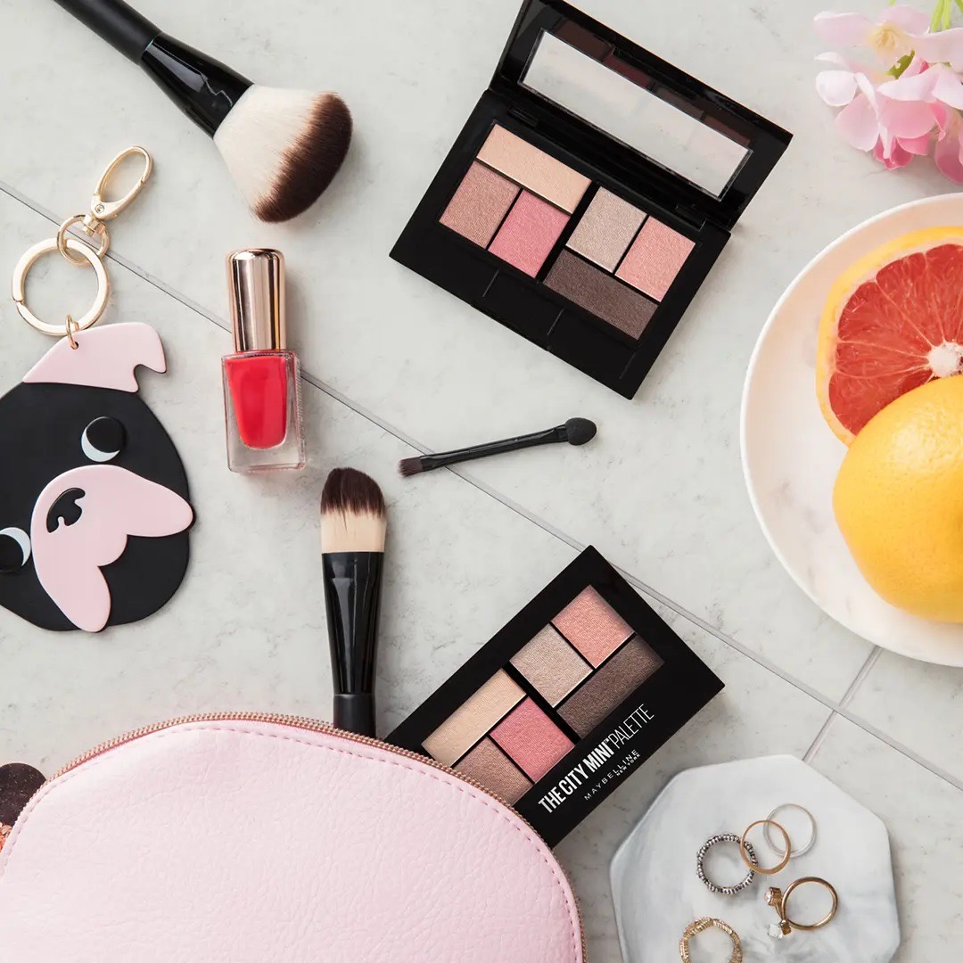
The argument for honest imagery is easy to make on principle. It is more persuasive on economics. An inaccurate beauty image tends to end in a return, a return often ends in a review, and enough of those pull down a listing’s standing and the traffic that follows. Framed that way – accurate photography generates fewer returns and more repeat buyers – the investment in colour management stops being a nicety and becomes obvious.
There is a longer game too. Beauty brands are built on trust: that the product will do what the pack claims, that the shade will be the shade in the image. A brand that keeps its photographic promises builds a relationship advertising can’t buy. A brand that keeps missing against its own imagery is paying to acquire first-time buyers who never come back. Visual honesty, in other words, isn’t a cost to trim. It’s an investment in the economics of loyalty – and we’ve watched the brands that track it out-perform the ones that don’t by a margin that dwarfs the shoot fee.
What This Says About Singapore’s Visual Culture
The honesty question doesn’t stay inside beauty, or inside ecommerce. It sits under a broader conversation about what images do in a culture saturated with them, and what image-makers owe the people looking.
Singapore’s visual culture in 2026 keeps its commercial and cultural imagery closer together than it used to. A hawker dish shot for Instagram and a production still from a theatre run do similar work – they represent an experience to people who weren’t there and argue that it was worth being there. Both ask the viewer to trust that the light, the framing and the composition are saying something true about the subject.
The discipline that commercial product photography brings to colour, material and truth isn’t unique to selling things. It’s the same discipline a documentary photographer applies, that photojournalists are held to, that art photographers wrestle with when they ask what they want an image to say and whether the medium can say it honestly. We raise it not to inflate product photography – getting a lipstick shade wrong is not misreporting an election – but because the questions the work forces on you are genuinely good ones. What does this look like? What do I want it to look like? How close can I get the photograph to the thing itself, and what am I willing to give up to get there?
Frequently Asked Questions
What is visual honesty in commercial photography?
It’s representing a product as it actually is – its real colour, texture, size and finish – rather than optimising the image for appeal at the cost of accuracy. It matters commercially because online platforms amplify inaccuracy into returns and reviews, and culturally because commercial images quietly shape what people expect products and brands to be.
How does colour management work on a beauty shoot?
Shoot under calibrated lighting at a controlled colour temperature, put a colour reference target into the session, correct on a calibrated monitor in a controlled room, and deliver files in the right colour profile for each destination. The point is that the red in the file matches the red in the tube, whatever screen it lands on.
Why is beauty harder to photograph than most product categories?
One range can hold glossy plastic, clear glass, brushed metal, foil and matte card, and each answers to light differently. On top of that, colour carries more weight in beauty than almost anywhere else – a shade mismatch drives returns in a way a slightly off photo of a kettle never would.
Why does shooting in Singapore for regional brands change the approach?
Because the images often have to work across several Southeast Asian markets at once, with different skin tones, platforms and tastes. That pushes you toward a more neutral, carefully calibrated treatment, and raises the premium on accuracy, since very different buyers will read the same frame.
GradePixel is a commercial photography studio in Singapore, producing product, food, fashion and corporate photography for brands across Southeast Asia. Our clients include L’Oréal, Sephora, Nestlé, Unilever, FairPrice, Under Armour, Levi’s, New Balance and Singapore Airlines. You can see more of our approach to product photography in Singapore at Gradepixel’s website.

